Role
Sr. UX Designer
-
Conducted extensive UX research and implemented findings into the design
-
Designed interactive Dashboards, Wireframes, Prototypes, Usability Testing
-
Collaborated with Stakeholders, Product managers, and Engineers
Tools

About This Project
O-Tracker, is an advanced AI-enabled website analytics solution designed for businesses across industries like digital marketing, retail, hospitality, and finance. The goal was to create an intuitive and actionable tool that allows businesses to track performance metrics in real-time, analyse user behaviour using heat maps, and customise modular dashboards tailored to their needs.
This Case study is focused on three core features
Dashboard
An interface that adapts to diverse business needs with drag-and-drop widgets.
Heat Map
Tools to visualise user interaction and behaviour with the site.
Real-Time Analytics
Instant updates for actionable insights.
Platform
Web-based with Tab & Mobile responsiveness
Design Timeline

Problem Statement

Businesses often struggle to interpret data effectively due to Overcomplicated dashboards that overwhelm users with irrelevant information. Switching between different tools to get deeper insights of user behaviour across platforms. Delays in data processing that hinder timely decision-making.
Solutions

-
Develop an intuitive analytics platform that Provides customisable dashboards for tailored insights.
-
Leverages heat maps to visualise user interaction patterns.
-
Delivers real-time analytics to facilitate quick, informed decisions.
Research
SURVEYS
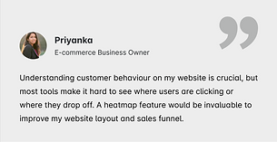
Organised survey with 25 potential businesses across various industries, the survey gathered data on the effectiveness of existing analytics tools to collect quantitive and qualitative data. The target audience were small and medium-sized businesses (SMBs) and large businesses.

Key Insights from Surveys

72% of respondents emphasised the importance of customisable dashboards.

68% rated real-time analytics as critical for decision-making.

Heatmaps were preferred by 60%, especially for marketing and e-commerce industries.
INTERVIEW
From the survey that I have done, I did filtering, and got 15 people for direct interview. I did online interviews using Zoom and invited them at different times.


User Interview Insights
-
Real-time updates can prevent significant losses in campaigns and business operations.
-
Heat maps help identify website usability issues but need simpler visualisation.
-
Custom Dashboards reduce time spent finding relevant data.
PERSONAS
I created detailed personas based on insights from surveys and interviews. These personas represent key user groups, highlighting their goals and pain points, ensuring the design aligns with real-world requirements.


CARD SORTING (OPEN & CLOSE)
I performed both open and closed card sorting techniques to organise information intuitively. Open sorting identified user-defined categories, while closed sorting validated predefined groupings, ensuring an effective structure for dashboards, heat maps, and real-time analytics.


USER JOURNEY MAP
Mapped out user's goals, actions, emotions, and pain points across key stages to identify opportunities for enhancing their experience with the features.

INFORMATION ARCHITECTURE
Structured the platform’s content into logical modules for dashboards, heatmaps, and real-time analytics, ensuring seamless navigation and accessibility.

Ideation
WIREFRAMES
Created low-fidelity wireframes to conceptualise layouts and functionality, focusing on clear workflows and user-friendly interactions.


USER TESTING
To ensure these features is user-centric, I conducted usability testing iteratively across the design phase
Objective:
- To validate basic layout, navigation flow, and content hierarchy.
- Are the layouts intuitive?
- Do users understand the structure?
- Are any sections or elements missing?
Outcome:
- Refine navigation structure and feature placement based on user insights.
Design
HI-FI MOCKUPS
Designed detailed, high-fidelity mockups that reflected the final look and feel of the platform, ensuring visual consistency and clarity.
Dashboard

Real Time Analytics


Heat Map


PROTOTYPES & TESTING
Developed interactive prototypes to test usability and gather user feedback on the platform’s functionality and features before development.
Hi-Fi Testing
Objective:
- Finalise UI design, interactions, and content clarity.
- Do the visuals and interactions feel polished and consistent?
- Are users confident in interpreting and acting on data?
- Do any usability issues remain?
Outcome:
- Make final adjustments to the design, ensuring a seamless and user-friendly experience.


Final Prototypes
Dashboard

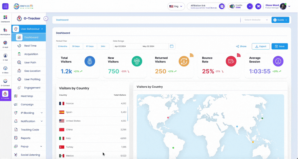
What It Does:
The dashboard is a customisable interface where users can organise, visualise, and access key metrics relevant to their business. It includes drag-and-drop widgets, modular layouts, and the ability to tailor data displays to specific business needs.
How It Adds Value to the Product:
- Provides flexibility to adapt to diverse industries and individual user requirements.
- Consolidates all critical data points into one easily accessible and interpretable space.
How It Solves User Pain Points:
- Allows users to select and display only the most relevant metrics, reducing information overload.
- Drag-and-drop widgets streamline data organisation and retrieval.
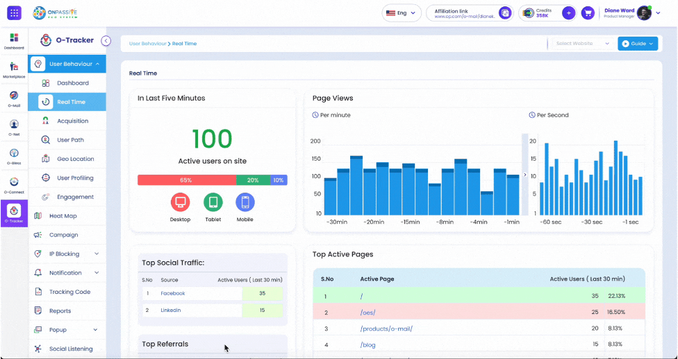
What It Does:
Real-time analytics delivers instant updates on key metrics, helping users monitor data as it happens. This feature ensures no delays in accessing actionable insights.
How It Adds Value to Product:
- Provides immediate feedback on performance, allowing businesses to respond to trends and issues without delays.
- Enables real-time tracking of campaigns, user behaviour, and operational metrics.
How It Solves User Pain Points:
- Updates are instant, ensuring users have the latest insights at their fingertips.
- Facilitates rapid response to emerging trends and issues.
Real-Time Analytics
Heat Maps
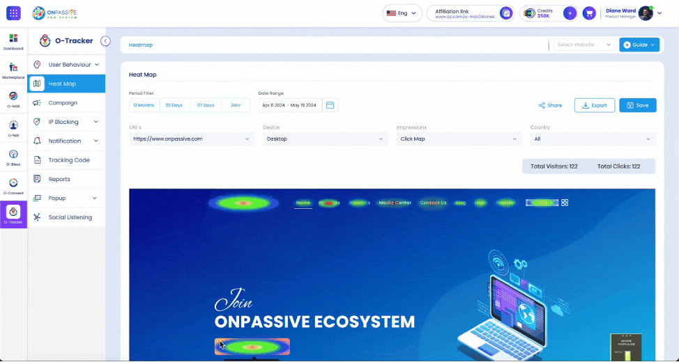
What It Does:
Heat Maps visually represent user interaction patterns on websites or platforms, highlighting areas of high engagement (e.g., clicks, scrolls) and identifying underutilised sections.
How It Adds Value to Product:
- Enhances website usability by identifying areas that attract or repel user attention.
- Offers actionable insights into user behaviour, helping businesses improve website layout and content placement.
How It Solves User Pain Points:
- Provides a visual map of interactions, making it easier to pinpoint what works and what doesn’t.
- Highlights problematic areas, enabling data-driven changes.
DESIGN SYSTEM
Built a comprehensive design system with consistent typography, colour schemes, and components, ensuring scalability.

Key Takeaways
- Modular design is crucial for diverse user needs
- Simpler heatmap visuals drive better usability
- Real-time insights significantly boost user confidence in decision-making
Next Steps
- Introduce AI-driven insights for predictive analytics.
- Automated notifications on real time updates.